Anatomy of an Internal Link

Internal Linking to Promote Keyword Cluster explained the math of how strength passes internally between pages of a website and how it can be influenced with a focused and planned internal linking structure. The limitation of this approach is that it assumes that all internal links are created equal. This isnt the case.

Several factors influence the weight and relative importance of an internal link. For example the format of that link, its position on the page, its position relative to other links, etc. While the specific way that the engines weigh individual links is not known (and would likely change even if it was), there are principles you can be apply to understand how the weight is being carried through your site past simple mathematics.

The simplest (and arguably most effective) first step is to think like a visitor. In the desire for search engines to provide as relevant a result as possible, they work hard to emulate as best they can a visitor experience.

While the fine folks at Google (and Bing of course) can't visit every site on the web, they can create automated systems that do an excellent job at understanding how the web works, how elements are positioned on a page, and what those elements look and behave like. From this they can gather an understanding of how important a link is.

Let's look at the following basic diagram of a simple website (the dotted line indicates where the fold line is, everything above it is visible to the average user on first visiting the site):

The rule of thumb you can follow is this: the more visible the link is, the higher the weight it will pass. Let's look at each of the main link elements and grade them on a scale of 1 to 10:

I list the sidebar links first as I tend to use them as my baseline. Sidebars are often the spot for links you want people to be able to find easily enough but not important enough to make it to your main navigation. They are positioned above the fold, however there are usually many of them in a list, thus reducing their visibility. When I'm thinking about my weighting of links, I usually use the sidebar links as the baseline at 5 and grade the rest up-or-down from there.

This is the single most visible link area on a page. The majority of websites use the logo as a link to the homepage. The weight of this link will be high as Google knows that this link is extremely visible and highly clickable. As far as a link zone is concerned, the header is the 10 as far as potential weight passing is concerned.

These links are highly visible and engines know that these links tend to point to the key pages on a website. This is where you as a visitor look to find product or contact information, and the engines know that. Pages linked to in this area will be given a high relative weight. This zone is given a 9 out of 10 for weighting.

See the article here:
Anatomy of an Internal Link

Anatomy of attack ads that work – or flop

(CBS News) NEW YORK -- This year's presidential race is expected to be the most expensive ever.

The campaigns and their supporters will spend billions of dollars on television ads before it's all over.

Longtime Republican strategist Frank Luntz, a pollster and communications specialist, has studied hundreds of political TV spots.

He says most don't work.

"You get about 20 percent that actually help the candidate that they're designed to support," Luntz observed on "CBS This Morning." "Twenty percent turn people off -- and that's what's amazing about this -- because they don't understand the ad, it's too complicated, it's too gimmicky. And so, the person watching it actually ends up supporting the other candidate."

To determine whether an ad will hit the spot, media companies bring people into rooms and measure their response.

"We use something called 'instant response,' Luntz explains."And (people sitting in a room) react on a second-by-second basis. The dial is about the size of a remote control. They turn it up to every word, every phrase, every visual. And so, we can figure out, second-by-second, the exact moment when something either works, impacts them, or turns them off."

Full coverage: Election 2012

Luntz showed examples of ads taking on both President Obama and his presumptive GOP rival, Mitt Romney. Both, he said, have their intended impact.

Both used their own word against them, showing actual statements they made that their foes would feel came back to haunt them.

View post:
Anatomy of attack ads that work - or flop

Lara Dann

Lara Dann heart

Lara Dann heart detail

Lara Dann Requiem for a lady

Lara Dann is an artist with quite a varied and inspiring path in life.  At the end of a 6 year career in advertising design, she decided to leave, go back to school and become a licensed massage therapist, specializing in deep tissue therapy.

Lara says of her experience,

I had a strong personal desire to lead a life with more meaning and purpose so I decided to take a bold leap and a different direction into a career as a licensed massage therapist.  I am pleased with the decision, as it enriched my life and also my knowledge of the human anatomy.

After 8 years and 2 children, Lara has spent the last 3 years perfecting her art skills and developing her vision as an artist.

To learn more about Lara Dann and to see more work, read her fascinating interview on Eclectix.  It was a joy to read this morning over a cup of coffee!


[via Eclectix]


Source:
http://feeds.feedburner.com/streetanatomy/OQuC

Ashkan Honarvar’s War Faces

Ashkan Honarvar Faces 5 (2)

Ashkan Honarvar Faces 5 (1)

Ashkan Honarvar Faces 5 (3)

Ashkan Honarvar Faces 5 (4)

The fact that the wounds on these men’s faces are made of candy and ice cream makes them oddly unsettling. Utrecth-based artist, Ashkan Honarvar’s War Series seems to beautify what is inherently absent from fatal or horribly disfiguring wounds inflicted by soldiers during war.

Ashkan says his work, “constitutes a search for a universal representation of the evil latent in every human, providing an opportunity for reflection. His aesthetic dissection has an intriguing macabre nature, which opens the images to interpretation.

Ashkan has quite an extensive portfolio that you can peruse at ashkanhonarvar.com (some pieces NSFW unless you’re lucky enough to be in an office where no one can see your computer screen…).


Source:
http://feeds.feedburner.com/streetanatomy/OQuC

Anatomy of a Drug Manufacturing Plant (Last in a Three-Part Series Examining the Financial Impact of New Plant …

SUGAR LAND, TX--(Marketwire -06/18/12)- Reported by Annette Kreuger for Industrial Information Resources Sugar Land, Texas) -- Once construction has wrapped up and the validation process for a new pharmaceutical or biotech (pharma-bio) plant is complete, it is time to begin production. Not only does an operational plant manufacture drug products that improve the public's physical health, but it also sets off a ripple effect that is beneficial to the financial well being of the host community, county and state.

In the past 12-month period (6/2011-6/2012), 83 new Pharmaceutical & Biotech Industry plants began operations in North America. Industrial Info is tracking 185 additional new-build (or lease and equip) projects in various stages of planning, engineering or construction.

For details, view the entire article by subscribing to Industrial Info's Premium Industry News at http://www.industrialinfo.com/showAbstract.jsp?newsitemID=224180&refer=mw, or browse other breaking industrial news stories at http://www.industrialinfo.com.

Industrial Info Resources (IIR), with global headquarters in Sugar Land, Texas, and eight offices outside of North America, is the leading provider of global market intelligence specializing in the industrial process, heavy manufacturing and energy markets. Industrial Info's quality-assurance philosophy, the Living Forward Reporting Principle, provides up-to-the-minute intelligence on what's happening now, while constantly keeping track of future opportunities. To contact an office in your area, visit the http://www.industrialinfo.com "Contact Us" page.

See the original post here:
Anatomy of a Drug Manufacturing Plant (Last in a Three-Part Series Examining the Financial Impact of New Plant ...

"X-ray Visions: Drawings and Prints from an Artist Residency at the NYU School of Medicine," Works by Laura Ferguson, Through August 13

On through August 13th at MSB Gallery at the NYU Health Sciences Libraries:

X-ray Visions: Drawings and Prints from an Artist Residency at the NYU School of Medicine
MSB Gallery, June 11 - August 13, 2012

What if we could look into the body’s inner space with a kind of enhanced x-ray vision, without the need for dissection or medical imaging – perhaps lit by candlelight, with an eye to the beauty within? As an artist at NYU’s School of Medicine I’ve worked to create this kind of personal vision, making drawings in the Anatomy Lab and from 3D radiology images of my own body.

Art looks beneath the surface of life, and for me the place to look has always been the body. A curving spine – asymmetry at my core – means that for me, walking, moving and even breathing require conscious effort, an engagement with the workings of my bones and muscles, nerves, and senses. Drawing myself lets me work from the inside out, to visually convey the feeling of inhabiting this particular, individual body, and the many ways that personal identity and even consciousness are rooted in physical experience.

I see my work as following in the Renaissance tradition of Leonardo da Vinci and his great anatomy drawings, informed by the new ways of seeing made possible by contemporary medical imaging technologies. As a patient with a lifetime of x-rays, I was always fascinated by these mysterious, shadowy pictures – but felt disconnected from a part of me that seemed to belong more to my doctors than to me. As an artist I’ve been able to reclaim this hidden territory for myself, and hope my work can bring viewers to feel a deeper sense of connection with their own unique inner spaces.

Learn more about the floating colors process.

You can find out more by clicking here.

Source:
http://morbidanatomy.blogspot.com/feeds/posts/default?alt=rss

Interview with James Archer of Anatomy Blue

James Archer Anatomy Blue clot
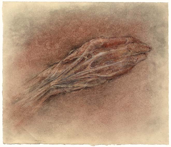
Clot – illustration for print, personal work, ©2012 James Archer

With an MA in Biomedical Communication from UT Southwestern and tremendous experience in the medical illustration/animation scene, James Archer is particularly sought after for his artistic style and approach to work. His 3D medical illustrations captivate the viewer with their diffuse lighting, organic hues, intimate depth of field, and overall softness that make anatomy and science look almost poetic.

I had the opportunity to work with James on a medical animation project recently and for someone with such a high standard of detail and execution, he’s an extremely laid back guy. He’s also impressively nonchalant about his incredible talent. I caught up with James after our project to uncover more about his background, technique, and cool personality.


SA: Tell us a bit about your background and what pulled you into medical illustration.

JA: I grew up in North Georgia in a town called Lilburn. As a child I loved to draw, an activity that would occupy much of my time. As I grew older I developed the ability to create highly detailed, photo-realistic drawings. I would sometimes setup a still life on the kitchen table or my bedroom floor and sit there for hours recording every detail with pencil and paper. Looking back it seemed more like an obsessive-compulsive behavior than a truly artistic endeavor. I now find that there is a strong association between art and obsession.

James Archer Anatomy Blue arteriovenous malformation

SA: Medical illustrators tend to come from an educational background that balances science with formal art training. You received a degree in biology and art history. Why did you choose art history and not a more specific studio art degree? How has a background in art history informed your work?

JA: My decision to major in Art History was one of convenience. After graduating from high school, I was accepted at Emory University on a four-year scholarship. While Emory does not offer a BFA, receiving the scholarship was a blessing. At the time I had no money and could not possibly attend another school without student aid. Attending Emory and majoring in Art History and Biology was the logical choice.

I find that the study of Art History provides context, a sense of place and time. It provides a set of values for which to judge works. And most importantly, it provides a sense of community, a feeling of belonging.


SA: Did you specialize in 3D illustration/animation at UT Southwestern? What motivated you to go in the direction of animation as opposed to traditional medical illustration?

JA: I certainly placed a greater emphasis on 3D illustration assignments compared to traditional illustration assignments. I believe that my interest in 3D illustration and animation was nothing more than an attempt to satisfy a long held obsession to visually recreate the world around me in near photographic form. The creation of synthetic imagery is relatively straightforward with today’s software. The real challenge lies in creating imagery that is emotive.


SA: You worked for quite a few top medical education companies and organizations early in your career such as WebMD, Nucleus Medical Art, and National Library of Medicine. What experiences did you gain from these organizations and when did you decide to start your own business?

JA: Working for Nucleus and WebMD represented a turning point for me. Even though I was given some amazing opportunities at each of those companies, I discovered that I had absolutely no interest in creating purely didactic materials. Instead, I wanted to find ways of reaching people on an emotional level. If your objective is to produce positive health outcomes in a given population then your campaign must include an appeal to emotion.

Working for the National Library of Medicine proved to be the genesis for Anatomy Blue. My primary responsibilities included research and development in 3D animation and production standards for broadcast and video. While working for NLM, I was completely immersed in 3D software and rendering technology. It was during that time that I began to develop lighting and texturing techniques that would later come to define the Anatomy Blue style.


James Archer Anatomy Blue virus
Virus – illustration for print collaterals for pharmaceutical company – ©James Archer

James Archer Anatomy Blue aspergillus
Aspergillus – illustration for print collaterals and booth display for pharmaceutical company – ©James Archer

SA: Flipping through the Medical Illustration Sourcebook, your style always stands out to me for its soft colors, beautiful lighting, and intimate depth of field. You bring such an artistic touch to 3D medical illustration that is unrivaled in my opinion. Can you tell us a bit about how your style evolved into what it is today?

JA: My style is more akin to punctuated equilibrium than gradualism. Aspergillus and Virus were created nearly a decade apart but they look as if they are from the same time period.

There are a number of themes that I’m gradually refining over time, themes like obsession, realism, context and emotion. The image, Virus contains only two elements, a background and a virus, yet there is an implied story, a subtext that is supported by a heightened sense of realism, context in the absence of information. While this may all seem conjectural, I think that the purposeful consideration of these themes have helped me to create work that is unique and engaging.


SA: The name Anatomy Blue comes off as a bit mysterious, soft and melancholic, somewhat reflective of your style. Is there a story behind Anatomy Blue?

JA: I love your analysis, by the way! On its surface, Anatomy Blue is an analog of medical illustration. I agree; the name does embody a certain mystique. Coming from a medical illustrator who is obsessed with [the band] No Depression, a name like Anatomy Blue makes perfect sense.


SA: What is a typical day for James Archer like? What are the challenges of balancing family life and a self-run business?

JA: My greatest challenge is squeezing every second out of every day. I sometimes find myself obsessing over ways to optimize even the most menial of tasks. I’m sure it drives my wife crazy.

First and foremost, I am dedicated to my wife and two children. I would sacrifice my business obligations if I thought they were compromising my family life or values. That being said, balancing family life and work is not easy. The key is to set boundaries. If that means not picking- up a client call while your child is excitedly showing you their latest artistic creation, then you just let the phone ring.


James Archer Anatomy Blue heart
Heart – ©James Archer

SA: How is the market for medical animation doing in the US right now? As a solo medical animator, do you find it difficult to compete with the bigger shops in the US and around the world?

JA: I can’t say that I’ve seriously targeted the animation market. I’m certain that some clients will feel a sense of security knowing that their job is being handled by a small team as opposed to a solo medical animator. However, it is a segment of the market that I’m eyeing more and more each day.


SA: Apart from the ubiquitous use of skulls, what is your take on the growing trend of anatomy and art in pop culture? Does a particular artist that effectively uses anatomy in their work inspire you?

JA: The use of anatomy in art and popular cult raises more questions than answers for me. I suspect that anatomical art may help to demystify fears and ease anxieties related to human anatomy. For others, anatomical art may be a source of anxiety. Either way, I’m fascinated.

I have always found inspiration in works by James Jean. Flip, Homeopathic, and Chemistry are just a few of my favorites. His command of the human form is amazing. He designed a set of three skate decks that depict the expulsion of Adam and Eve from Eden. The tree of knowledge of good and evil is depicted as a fully dissected circulatory system. Every time I look at it I want to take up skateboarding.


View more of James’ incredible work at anatomyblue.com!


[originally published in the AMI spring newsletter]


Source:
http://feeds.feedburner.com/streetanatomy/OQuC

"Imagine" examines the anatomy of brilliance

Imagine How Creativity Works By Jonah Lehrer Houghton Mifflin Harcourt. 252 pp. $26

Reviewed by Rickie Roberts

What do Bob Dylan, MIT, 3M, Tel Aviv, and the "I 0 New York" logo have in common?

In Imagine, author Jonah Lehrer weaves all of these people, places, and things into a brilliant narrative about well, simply put brilliance.

Lehrer is the author of two other equally engaging books, Proust Was a Neuroscientist (2007) and How We Decide (2009). Here, in only his third decade on this Earth, Lehrer has found a recipe for interpreting the insights, impulses, and creative possibilities of the most complex species on the planet. A graduate of Columbia University, he did a double major in neuroscience and English. In this unlikely pairing of disciplines, he has found a calling putting the highly intricate processes of the human mind into a language and a narrative that bring home his ideas to the more narrowly educated reader. In Proust Was a Neuroscientist, he explored the connection between the literary and scientific communities, and in How We Decide, he tackled the multifarious issue of decision-making by tying neuro-mechanics, context, culture, emotions, and history into a combination "how-do-we" and "how-to" book.

In Imagine, Lehrer has gone one step further. By exploring the common thread of imagination in the divergent worlds of song-writing, tape manufacturing, city building, play-writing, animation producing, mop inventing, and so much more, he is able to draw upon his unique combination of skills, knowledge, and experience to welcome the reader to a creative process that is becoming more and more critical in our society.

In chapter after chapter, he brings forward case studies of the contributions that creativity and imagination have made in success stories, ranging from bartending to pharmaceutical manufacturing. But he doesn't stop there. Through careful analysis of each case he helps us to understand the process that has taken place. From what is happening in neurotransmitters at the time of insight to the paint color on the walls, he guides us through these stories as if the lessons we learn here will make each one of us somehow capable of great things.

While he makes great use of his own scientific education and background in the narrative, Lehrer is able to do so in a way that makes even us common folk comfortable. He neither speaks over our heads in scientific matters nor does he seem to assume that the reader doesn't understand how the brain functions. He speaks of the right- and left-side brain functions without over-explanation, giving his readers credit for knowing enough about these topics to put the pieces together. Many a reader will appreciate this because once you accept that we are not all Ph.D,s you can relax and take this thrilling ride through the relationships between failure and accomplishment, brilliance and biochemistry.

Smartly, Lehrer begins the books with two studies that immediately put you at ease and suck you in with the curiosity that a well-crafted book can generate: the invention of the Swiffer Sweeper and the ubiquitous musings of Bob Dylan. Who wouldn't want to read on?

His tale of how Bob Dylan "hit the creative wall" in 1965 and retreated to isolation before producing some of his most brilliant work is antithetical to his account of how Pixar Studios uses collaboration and criticism to support the creative process that has driven so many of the most heralded animated classics of the last 30 years. Yet, Lehrer makes it work. He neither prescribes nor lectures, allowing that both isolation and collaboration have value in the creative process and must be examined in the context of the task.

See original here:
"Imagine" examines the anatomy of brilliance

The Art of Illusions: Pre-cinematic Entertainment in Mexico, Velaslavasay Panorama, Los Angeles, June 16th


If only I lived in Los Angeles....

This Saturday, at the fantastic Velaslavasay Panorama:

The Art of Illusions
Pre-cinematic Entertainment in Mexico
An Illustrated Lecture by José Antonio Rodríguez
Saturday, June 16th
8 o ’clock pm
Tickets $12 {$10 VPES Members}
Advance tickets are highly recommended and are available at
https://www.brownpapertickets.com/event/242705
_____________________

The Velaslavasay Panorama welcomes José Antonio Rodríguez, who will be here to present an illustrated lecture about pre-cinematic entertainment in Mexico.

Having conducted research on the subject for many years, José Antonio Rodríguez will talk about the multitudinous forms of optical magic, including the magic lantern, diorama, cosmorama, panorama and scientific spectacles which were once popular throughout Mexico and beyond. Professor Rodríguez will discuss the entertainments and forms of visual culture in the eighteenth century as they were experienced in Mexico, which inspired and made possible the proliferation of moving images. He will also address the archaeology of visual media which encouraged the later popularity of the Kinetoscope and the Cinematograph in nineteenth century Mexico. In essence, "The Art of Illusions" will present ideas about how our encounters with visual spectacles guide us in constructing our own vision of the world.

José Antonio Rodríguez is an Art History professor of at the Universidad Nacional Autónoma de México (UNAM) and the author of the landmark publication The Art of Illusions: Pre-cinematic Entertainment in Mexico published through the National Institute of Anthropology and History in Mexico. He is also the author of Edward Weston: The Look of Rupture; Bernice Kolko: Photographer; Ruth D. Lechuga: A Mexican Memory; and Agustin Jimenez: Memories of the Avant-Garde. He is also the editor of the magazine Alquimia, amongst other works. This will be Professor Rodríguez's first appearance in Los Angeles.
This presentation has been funded in part by The Department of Cultural affairs of the City of Los Angeles, The Andy Warhol Foundation for the Visual Arts and The Velaslavasay Panorama Enthusiast Society.

You can find out more by clicking here.

Source:
http://morbidanatomy.blogspot.com/feeds/posts/default?alt=rss

A Few More Slots Left: "Drawing from the Bestiary: Animal Anatomy of Real and Imagined Creatures," Class with Artist Saul Chernick, Observatory, June 25-July 16

We still have just a few more slots available for the upcoming class "Drawing from the Bestiary: Animal Anatomy of Real and Imagined Creatures" with one of our favorite artists, Saul Chernick. This class will teach students--via illustrated lectures and in-class projects including paper puppets and the creation of bestiary pages--"to use observational and imaginative drawing skills in tandem to capture the essential qualities of their subject" and "learn to draw animals (real, mythic, and otherwise) with greater skill and sensitivity."

You can see some of Chernick's wonderful artworks above; you can see more of them by clicking here. The class will take place on 4 consectutive Mondays, from June 25 to July 16th. The full class description follows. Also, please note that the class size is limited to 15, so if you are interested, please RSVP as soon as possible to morbidanatomy [at] gmail.com.

Drawing from the Bestiary: Animal Anatomy of Real and Imagined Creatures with Saul Chernick
A 4-part class with Artist Saul Chernick, M.F.A., Rutgers University
Dates: Mondays June 25, July 2, July 9 and July 16th (4 consecutive Mondays)
Time: 6:30-9:00 PM
Class Fee: $120
***Class size limited to 15; Must RSVP to morbidanatomy [at] gmail.com
This class is part of The Morbid Anatomy Art Academy

Contemporary artist and arts educator Saul Chernickis renowned for gorgeous artworks featuring convincingly corporeal depictions of imaginary or mythical creatures rendered in the style of Medieval and early Renaissance woodcuts from Northern Europe. Observatory is very pleased to announce a new workshop developed by Saul Chernick specially for the Morbid Anatomy Art Academy. In this class, Chernick will teach students--via illustrated lectures and in-class projects including paper puppets and bestiary pages--"to use observational and imaginative drawing skills in tandem to capture the essential qualities of their subject" and "learn to draw animals (real, mythic, and otherwise) with greater skill and sensitivity."

Full class description follows; you can see more of Chernick's fantastic work by clicking here. Class size limited to 15; Please RSVP to morbidanatomy [at] gmail.com.

Course Description
Open to artists of all levels, the goal of this workshop is help participants learn to draw animals (real, mythic, and otherwise) with greater skill and sensitivity. Through exercises in drawing and paper puppetry, participants will gain a deeper understanding of the skeletal/muscular structures of most mammals, reptiles, and birds. Participants will also learn to use observational and imaginative drawing skills in tandem to capture the essential qualities of their subject and create works of convincing visual fiction!
What to expect

  • Participants will cull images from the web to create a dossier on the animal(s) that interest them
  • Participants will fashion movable paper puppets to understand how their chosen animal moves
  • Participants will draw studies of the skeletal and muscular structures of animals
  • Participants will use the medium of their choice to create a Bestiary page entry that depicts an animal situated in an environment

Materials
What to bring to the first class:

  • Choose 1-3 animals and gather pictures on the web. Be sure to get images of their skeletons in profile. Please print these as they may be hard to use on a phone screen.
  • 3-5 sheets of Bristol Board Paper 9" x 12" or larger
  • Pencils & erasers
  • Scissors
  • Xacto or utility knife
  • Glue

What to bring for subsequent classes:

  • White or tinted drawing paper 16" x 20" or 18" x 24"
  • Tracing paper (same size as drawing paper)
  • Mechanical and/or regular pencils (2h, hb, 2b, 4b)

Optional:

  • Markers, watercolors, gouache, ink, brushes, chalk/oil pastels, colored pencils, Caran D’Ache, collage papers, etc (we’ll discuss further in detail!)

Saul Chernick, M.F.A., Rutgers University, is a visual artist and educator. Chernick has exhibited internationally in galleries and museums including the Aldrich Museum of Contemporary Art, the Bronx Museum of Art, the Jewish Museum of Art, as well as Max Protetch and Meulensteen Galleries in New York City. He has taught art for the public school system, the 92nd Street Y, Cooper Union, Parson's School of Design, and the Museum of Modern Art. He is currently the Professional Development Coordinator for the Joan Mitchell Foundation where he coaches New York artists in teaching art to young people throughout city. His work can be seen at http://www.saulchernick.com.

All images are by Saul Chernick and include, top to bottom:

  1. Field Urchin, 2011, from a series of studies in which he attempted to impose the proportions of cherubs onto horses.
  2. Desktop 2013, 2010, Ink, Watercolor, & Opaque White on Paper
  3. Heavenly Touch , 2009, Ink, Watercolor, & Opaque White on Paper
  4. Guilty Pleasures, 2010, Ink, Watercolor, & Opaque White on Paper
  5. Ars Gratia Artis, 2010, Ink on Paper

You can found out more here. As mentioned above, class size is limited to 15, so if you are interested, please RSVP as soon as you are able to morbidanatomy [at] gmail.com.

Source:
http://morbidanatomy.blogspot.com/feeds/posts/default?alt=rss

Anatomy of an aftermath: Movie being planned about Melinda Elkins Dawson

It probably is assumed by most people that Melinda Elkins Dawsons story had a definitive end.

In June of 1998, Dawsons mother, Judith Johnson of Barberton, was raped and murdered. A

6-year-old niece also was attacked and raped. Dawsons then-husband, Clarence Elkins, was charged with the crimes, based on the childs account to police.

After Clarence Elkins went to prison, Dawson took it upon herself to prove his innocence, an effort that took seven years.

Clarence Elkins eventually was able to surreptitiously acquire DNA evidence via a cigarette butt from Earl G. Mann, Johnsons former neighbor, who also happened to be imprisoned with Elkins. It matched DNA found at the crime scene. Mann eventually pleaded guilty.

After Elkins was exonerated and released from prison in 2006, he reached a $1.075 million settlement with the state. In 2010, the Elkins family settled a $5.25 million federal lawsuit against the Barberton Police Department. A suit against the Summit County Prosecutors Office was dismissed.

Dawsons life story recently was optioned by movie producer/screenwriter David Massar, who said a script is in development. Massar said he would like to shoot parts of the film in Barberton, Akron and the Magnolia area. The Elkinses were living outside of Magnolia in Carroll County when Clarence Elkins was arrested. The couple divorced in 2007.

TAX FIGHT

But these days, Dawson is fighting a different battle, this one with the Internal Revenue Service, which has informed her that she owes taxes on her share of the compensation money received from the federal suit.

We should not have to fight for something that was rightfully awarded to my sons, myself, and Clarence, she said. There needs to be an amendment to the federal tax law that will cover this subject, not only for my family but for the countless other families that will face this issue one day.

See more here:
Anatomy of an aftermath: Movie being planned about Melinda Elkins Dawson

Grey's Anatomy Star Eric Dane and Rebecca Gayheart Talk Kids—and the Show's Finale Surprise

Dane, 39, and Gayheart, 40, say Billie is finally warming up to little Georgina.

"Billie is being a great big sister now," Gayheart gushed to us at the Chrysalis Butterfly Ball in L.A.

"We've had a couple rough patches but she really adores her," she said. "She's really sweet. It's like her live baby doll."

That means Billie is getting more hands-on with mom and dad's baby duty.

"She helps change her diaper and give her food and put her bib on," Gayheart said, adding, "but sometimes she regresses and wants the pacifier for herself."

Meanwhile, Dane dished his thoughts about Grey's Anatomy's shocking season eight finale in which costar Chyler Leigh was surprisingly killed off.

"I wasn't [shocked] because I knew that Chyler wanted to spend some more time with her family," Dane said. "It's a tough schedule to keep up and she's been working on the show for five seasons. So I wasn't shocked. A little surprised but not shocked. We're going to miss her."

See more here:
Grey's Anatomy Star Eric Dane and Rebecca Gayheart Talk Kids—and the Show's Finale Surprise

Anatomy of Cain's perfect game

BOX SCORE

SAN FRANCISCO How difficult, how elusive, how magically fated is a perfect game?

Consider this: Matt Cain struck out 14 batters on an unforgettable Wednesday night in China Basin. It matched Sandy Koufaxs iconic performance in 1965 as the most strikeouts in a perfect game in history.

And yet Cain needed so much support, so many breaks, so much luck -- and maybe even some angels breath.

Here is how it happened, inning by inning:

First inning: 11 pitches. Cain likes to establish his fastball early and it was clear he had plenty of late movement and cut -- and pinpoint control -- as he threw four of them to strike out Jordan Schafer. He went fastball-curve-fastball to strike out Jose Altuve. Jed Lowrie hit a foul pop.

Second inning: 12 pitches. Before it became edge-of-the-seat stuff., Cain faced his first three-ball count of the evening. Brett Wallace, a player in the Moneyball mold, fouled off a 3-1 fastball. Cain hadnt thrown either of his first two changeups in the strike zone, but Buster Posey called for one. Wallace swung through it.

Third inning: 17 pitches. Cain began to find a groove with his changeup and slider. Chris Snyder and pitcher J.A. Happ took called third strikes on fastballs that snapped back across the zone. Umpire Ted Barrett was giving him the black, as pitchers call it. Cain had gone through the lineup once. Even at this early juncture, he could sense he had it within himself to no-hit the Astros.

Fourth inning: 22 pitches Schafer worked Cain for a 10-pitch at-bat that included five two-strike fouls -- including one that came within a millimeter, as first baseman Brandon Belt saw it, of being a double down the line. Replays were inconclusive; Belt said it definitely hit in front of the bag and was hooking sharply. Umpire Mike Muchlinski called it foul and Cain, now operating with a four-run lead after two-run homers by Melky Cabrera and Belt, stayed aggressive. He only threw one ball among the 10 pitches to Schafer, who finally swung through a fastball. Little Altuve, all 5-foot-5 of him, didnt get any breaks on the zone. Barrett rang him up on a third strike above the letters.

Fifth inning: 14 pitches Two more strikeouts. One ball in play, to second baseman Ryan Theriot. Moving along

Go here to read the rest:
Anatomy of Cain's perfect game

Anatomy of a grant: Emails indicate cancer agency sought to bypass scientific review

Lynda Chin is used to getting what she wants.

Chin, a physician who is the wife of Dr. Ronald DePinho, the president of the University of Texas M.D. Anderson Cancer Center, submitted a plan on March 12 seeking what would be the largest grant yet awarded by the Cancer Prevention and Research Institute of Texas, or CPRIT.

Chin had every reason to believe her seven-page application would win funding. She had received an $8 million enticement to move her cancer research lab from Boston to Houston last year after her husband accepted the M.D. Anderson position, and prospects for the success of her grant application seemed encouraging.

"We'll make it work," the cancer center's lead commercial grant officer had told her six days earlier.

But the same day it was submitted, Chin's application hit a snag.

"I don't think they are ready," Jerry Cobbs, the senior staff member who oversees commercialization grants for CPRIT, wrote his boss in an email after reviewing the application. He suggested consideration of the application be delayed.

Nevertheless, by the end of March, Chin had landed her grant - approximately $18 million for a single year.

A monthlong Houston Chronicle investigation suggests that CPRIT, a 3-year-old initiative backed by $3 billion in taxpayer funds, handled the grant application in a hasty manner designed to circumvent its own scientific reviewers.

Hundreds of internal emails obtained through a public records request shed new light on the forces at work in the application process - particularly the role of a Houston venture capitalist, Charles Tate, who invests in companies that commercialize drugs and who has ties to M.D. Anderson and to CPRIT.

The emails indicate that Tate, one of 11 members of CPRIT's oversight committee, was instrumental in shepherding Chin's proposal through the review process. He denied doing so.

See the original post here:
Anatomy of a grant: Emails indicate cancer agency sought to bypass scientific review

Anatomy of a Successful PPC Ad

So much technical work goes into your online marketing that you may get lost in the minutiae. Sometimes its easy to forget that creative advertising still matters.

A great example: ad copywriting, which plays a crucial factor in your companys success. Nowhere is this more evident than in PPC advertising, where you have little time to capture the attention of a potential customer.

Stop dwelling on audience targeting and all of the technical settings you can use. Its far more important to write ad copy that resonates with your customers.

Understanding the elements of a successful PPC ad include will:

There are five important PPC ad copy elements that will affect your prospects decision to take action and click through on your ad, and then once on your page to convert to a customer.

Your potential visitor is looking for a solution to their pain points. In fact, customers care about solving their problem, not necessarily buying your product. You must convince them that you will solve those pain points (support, new products, and services).

Saving money is a huge perceived value. Everyone wants to save money by finding a cheap way to solve their problem (or even better, solve the problem free of cost!). Your ad copy should emphasize what problem youll be solving for the user.

While your customers want to solve their problem, they also want to guard against the risk of wasting time and money. This is why risk reversal is such an important element of your ad copy.

To help users guard against risk, you must convince them of the value of clicking on your ad and not wasting time by getting suckered in to something that doesnt work for them.

At every step of the way, you want to reduce the friction of taking the next step. Convince users of the value of clicking on your ad, and you will get more relevant visitors.

Here is the original post:
Anatomy of a Successful PPC Ad

David Oliveira Wire Anatomy

David Oliveira Ribcage wire sculpture

David Oliveira Skeleton wire sculpture

David Oliveira Skeleton wire sculpture

David Oliveira Skeleton wire sculpture

David Oliveira Heart

David Oliveira Heart

I’ve been noticing a lot of this incredibly crafted wire art lately. I must say the spatial thinking and artistry that goes into these types of pieces is inspiring.  Lisbon-based sculptor David Oliveira creates these wire sculptures that look as if they were sketched in the air.  These are a couple of his anatomically themed pieces.  David knows quite a bit of anatomy—he received his Master’s degree in Artistic Anatomy from the Faculty of Fine Arts of the University of Lisbon, similar to a medical illustration degree.

View more of David Oliveira’s work on his website!
[via Colossal]

Source:
http://feeds.feedburner.com/streetanatomy/OQuC

The Autopsy Scar Tattoo

Jeffrey Silverthorne inspired tattoo on Richard Sawdonsmith

Jeffrey Silverthorne inspired tattoo on Richard Sawdonsmith

A friend of Street Anatomy’s since our gallery show in 2010, British photographer Richard Sawdonsmith has been working to expand his anatomical tattoos.  This has entailed extending the arteries and veins stemming from his heart tattoo on the front of his body.

A recent addition to Richard’s body is a full length back tattoo based on an autopsy scar inspired by Jeffrey Silverthorne’s photos of the 1970s.  Silverthorne is famous for his photos based on sex and death.  Take a look through Silverthorne’s photos here (NSFW).  His autopsy and morgue photos are particularly chilling, yet serene.


Source:
http://feeds.feedburner.com/streetanatomy/OQuC

Historical Portrait Skulls by Sébastien Pons

Sebastien Pons Sans titre, 2002 Photographie - 45 x 63 cm (2)
Sans titre, 2002 Photographie – 45 x 63 cm

Sebastien Pons Sans titre, 2002 Photographie - 45 x 63 cm (4)
Sans titre, 2002 Photographie – 45 x 63 cm

Sebastien Pons Sans titre, 2002 Photographie - 45 x 63 cm (3)
Sans titre, 2002 Photographie – 45 x 63 cm

Sebastien Pons Sans titre, 2002 Photographie - 45 x 63 cm (1)
Sans titre, 2002 Photographie – 45 x 63 cm

There’s something about these portraits of famous historical characters by French artist, Sébastien Pons, that I am thoroughly enjoying.  Perhaps it’s the playful seriousness of the masks with the decrepit skull underneath.

Sébastien has many more anatomical works on his portfolio site, sebastienpons.net.


Source:
http://feeds.feedburner.com/streetanatomy/OQuC